HTML + CSS - Lesson 5
Images and Fonts
In this lesson, we will learn how to add and modify an image, import fonts, and finally finish our home webpage. Throughout this lesson you will have the freedom to design your webpage how you see fits best based upon what was learned in the previous 4 lessons. After all, it is your website!
The biggest takeaway from this lesson should be that as you are working in web development, you are constantly making modifications to the previous designing that you have done. Having an appealing and practical website is what web developers work to achieve. This is exactly what we are doing in this lesson, adding new aspects to our website and modifying the previous ones to make sure it all fits together.
Next, we will learn how to add an image. Pick any image of your choice and put it in the folder that we made at the start of the course.
Then, we are going to go to the “p” section of the CSS. There, we will write:
background-image: url(name-of-your-image.____)
Next we have to style this image to make sure that it fits our website correctly. Here is some of the code I used to make it. This code below specifically allows us to take up the full background.
    background-size: cover;
    background-position inherit;
    height: 600px;
Here’s the code and the image I chose to use:
    p {color: white;
       background-image: url (space.jpg);
       background-size: cover;
       background-position: inherit;
       height: 600px;
       text-align: center;
       display: flex;
       align-items: center;
       justify-content: center;
       text-align: center;

With the galaxy background image that I chose, I noticed that the current font style does not achieve the feel of the website that I am trying to create. (Of course, the following steps are up to you! Again, design your website how you see fit!)
Although font choice may seem like a small detail in comparison to the whole website, font choice is one of the most important things in regards to the viewers’ view and feel towards the website.
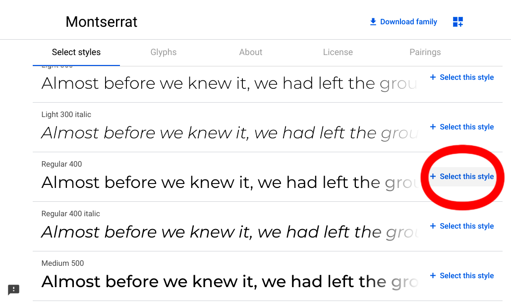
I therefore decided to import a font that I know will work better. To do this, I am going to utilize a great, free, resource: Google Fonts.
Once I found my desired font, I pressed “Select this style.”
Then, press “Embed” and select “Link."
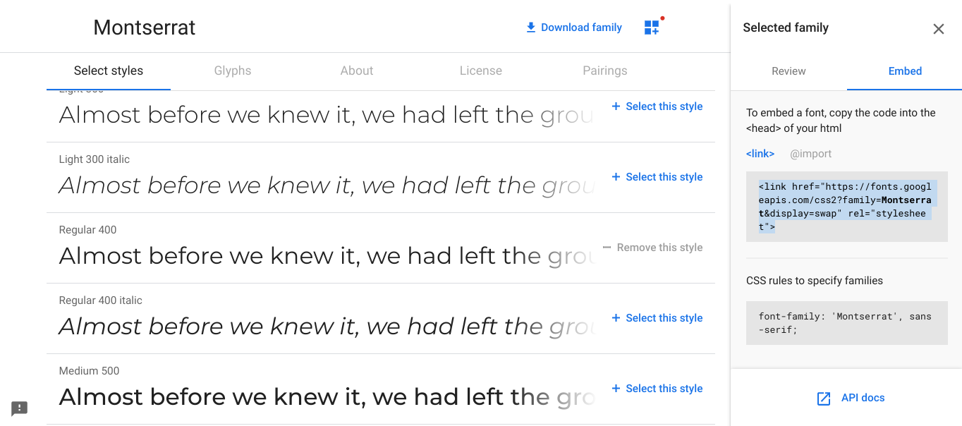
Place this under your body tag:
    <body>
      <link href="https://fonts.googleapis.com/css2?family=Montserrat:wght@400;600&display=swap" rel="stylesheet">
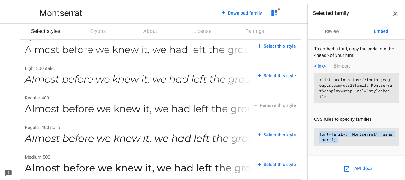
Now, we can go back to the line of CSS code that we worked on in a previous lesson,
    body {
    font-family:
and paste the labeled CSS code on the Google Fonts website:
Similarly, I changed the background color of the website to better match the galaxy image.
You can change the background color just as we did in previous lessons!
Here is what I did:
    <style>
      body {
      	font-family: 'Montserrat', 'sans-serif';
        color: white;
        text-align: center;
        background: rgb(19, 60, 121);
      }
You might be noticing that the text on your image does not really match well and is disproportional with the rest of the website. Therefore, I am going to change the size and positioning of the text to better fit this.
To do this go into the “p” section of the CSS.
We need to code:
    p {

    text-align: center;

    display: flex;

    justify-content: center;
These lines of code work together to ensure that our code is in the center of the background image which can be seen by defining the text alignment and the content justification to be “center.” The display being set to “flex” allows the text to fit within the entire “p” (paragraph) without overflowing it.
Next, I adjusted the font size and text in the same “p” to be bigger and to contain the name of my website but you can adjust this however you want. We already learned how to adjust the text in earlier lessons in HTML but to adjust the text size, use “font-size: ___ px” and adjust as you see fit. 100px worked well for my website.
Here is the code:
     p {color: white;
        background-image: url (space.jpg);
        background-position: inherit;
        height: 600px;
        text-align:center;
        display: flex;
        align-items:center;
        justify-content: center;
        font-size: 100px;
      }
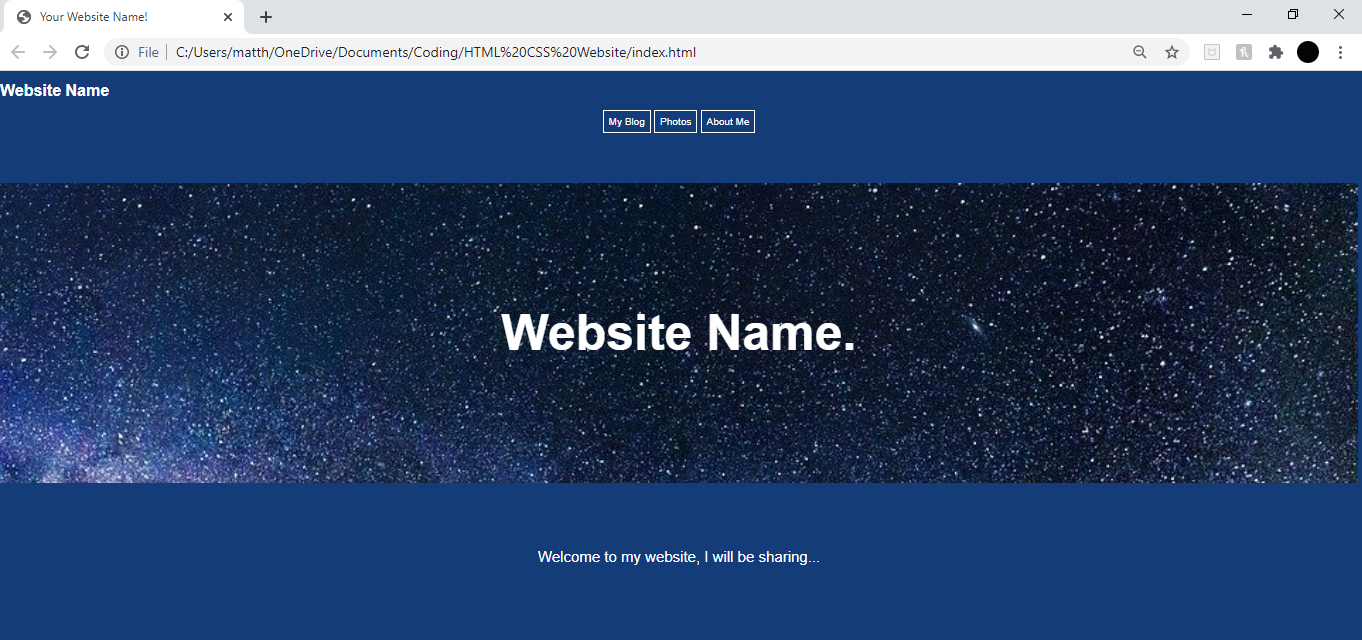
Now let’s see how this part of our website looks!

Now it is up to you to finish styling your front web page!
I decided to edit the header by moving it to the left:
    h1 {text-align: left;
    }
Then I wrote “Welcome to my website I will be sharing…” to the first section:
<section>Welcome to my website, I will be sharing...
Then I deleted the other section and the footer that were added previously as I thought they were not needed.
Feel free to add or delete elements based on what we learned in previous lessons!
Here is how my webpage looks like: